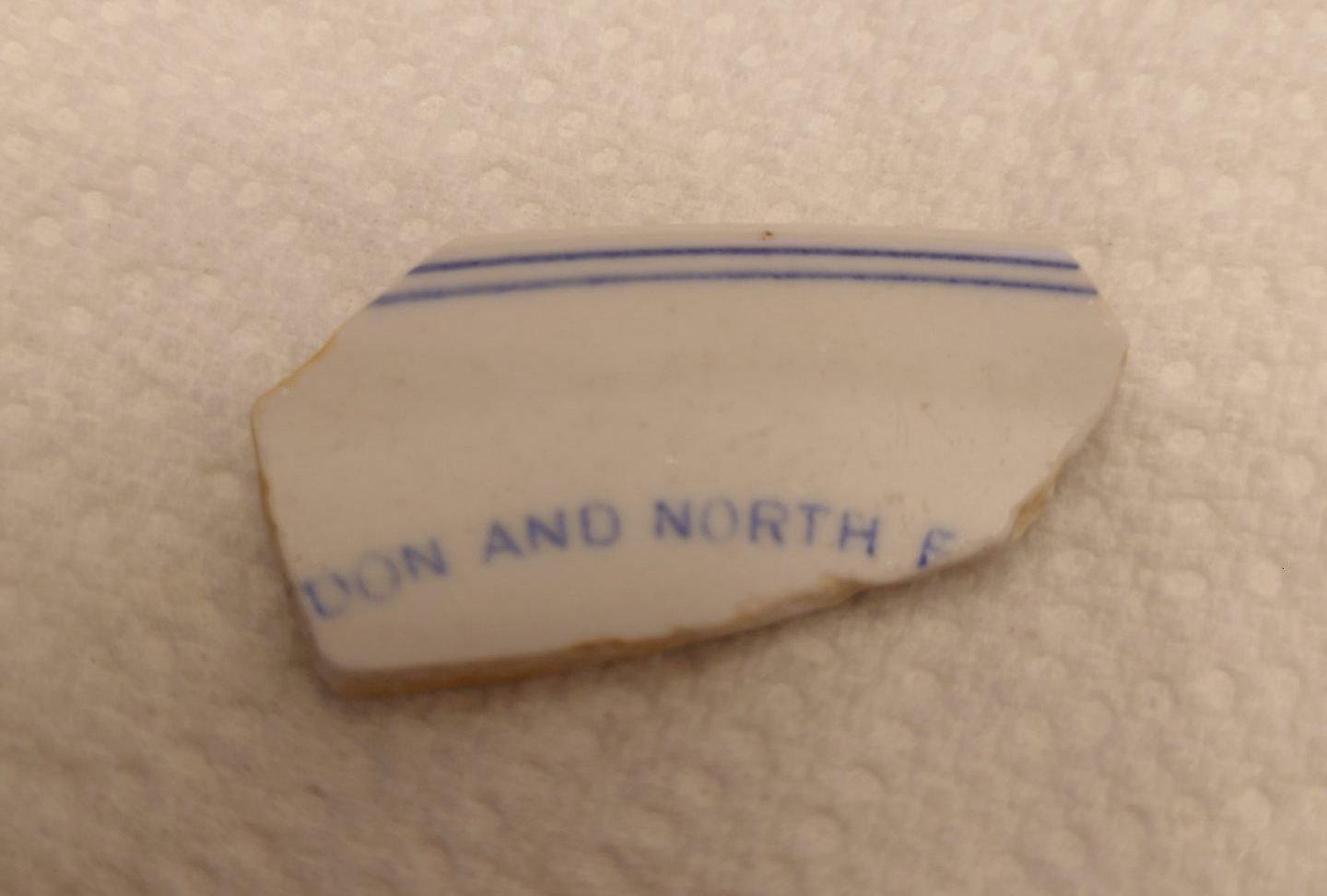
It’s always exciting to be able to quite specifically identify a fragment of china. This particular sherd rates about a one on the difficulty scale though!
The London and North Eastern Railway was the second largest of the “Big Four” railway companies in the interwar period, existing from the rationalisation of 1923 until the nationalisation of 1948. The interwar years are considered by many to be the peak of British rail travel. It’s an easy case to argue!
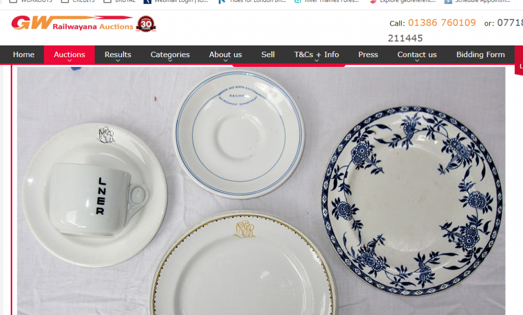
The blue, eye shaped LNER logo was introduced in 1932; earlier pieces would feature the fancier LNER monogram. the blue LNER logo features their corporate font choice, Gill Sans, which was adopted by British Railways until replaced by the brilliant Rail Alphabet in 1965.
LNER had some of the best trains, in several senses of that – they had the coolest class (A1/A3), the best individual train (Mallard, an A4 Pacific) and the best named express service (the Flying Scotsman, run by BR and the new LNER to this day).
I’ve identified this particular piece as from a saucer based on this eBay listing:
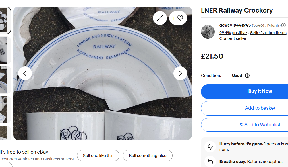
https://www.ebay.co.uk/itm/225495653978
The listing also includes examples of cups bearing the earlier monogram.
There’s also an interesting listing from 2019 here – I’m sure I’ve got a fragment of the floral print somewhere so will be off for a rummage.
Watch this space as I build my railway china collection. 🙂 You can also join my private Facebook group for more:
https://www.facebook.com/groups/mudlark.london
The cup and saucer in a 2016 listing (https://www.ukrailwayana.com/20160009/l_25A.htm) are intact and described as made by Pountney & Co of Bristol – “The Bristol Pottery”. More about them can be found here:
https://www.thepotteries.org/features/pountney1956.htm
and:
Leave a Reply
You must be logged in to post a comment.